Snapp
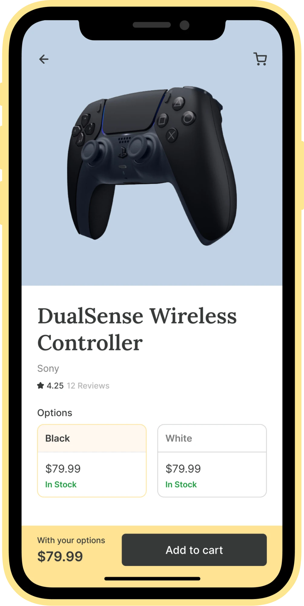
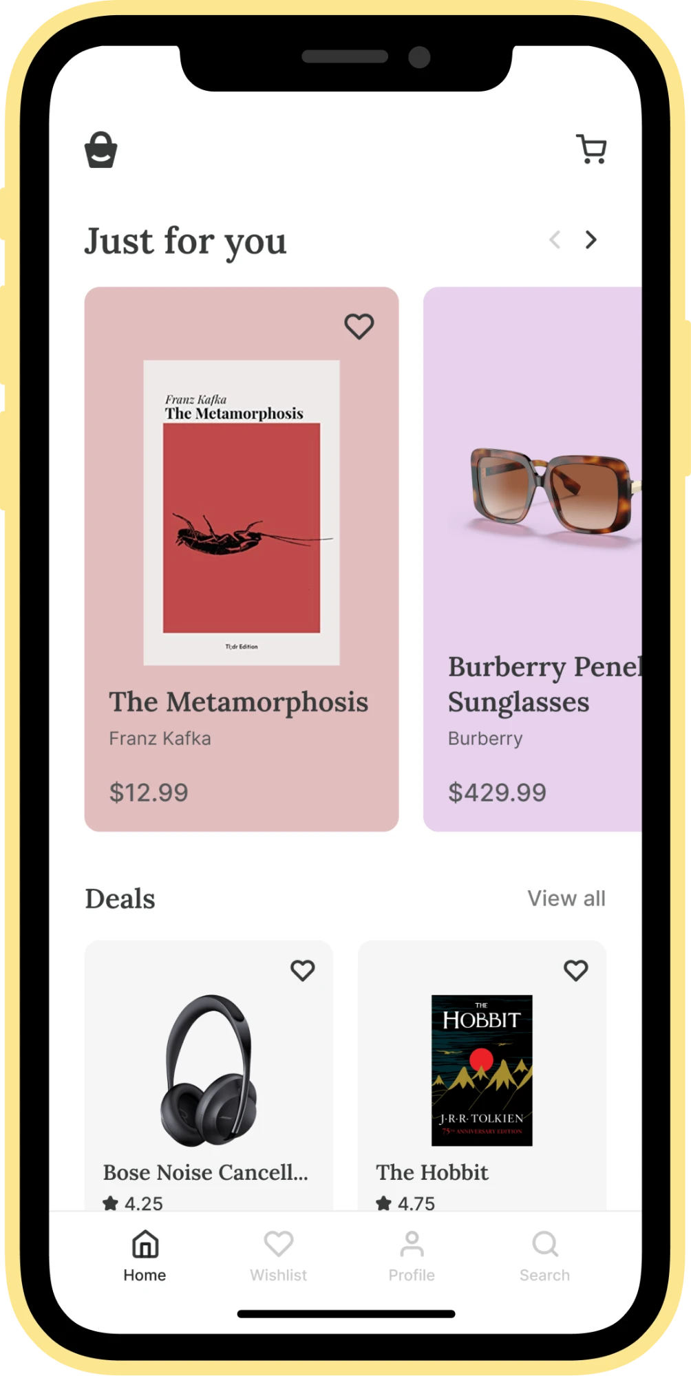
Problem solvedWith its user-friendly interface and quick delivery options, Snapp offers a better user experience and journey than its market competitors. Snapp provides a wider selection of goods at reasonable prices, keeping price, stock and variant selection visible without scrolling — the order-tracking and personalized "for you" screens carry that same visual language throughout.
Hand sketches first, iterated twice before any pixels
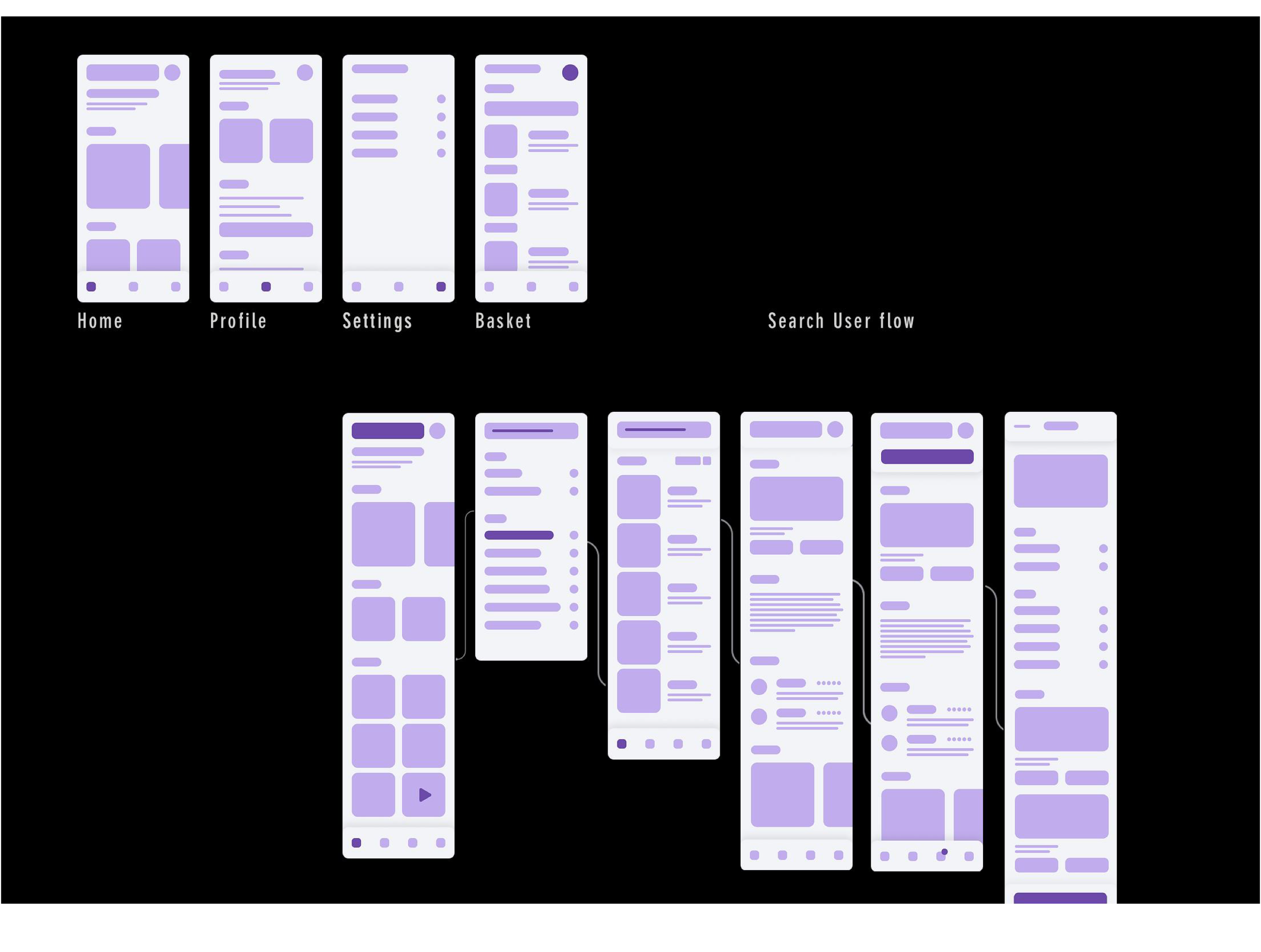
Every flow started on paper — Home, Profile, Ordered and Track, plus a five-step search-to-checkout sequence — sketched once, then iterated a second time once the gaps became obvious.
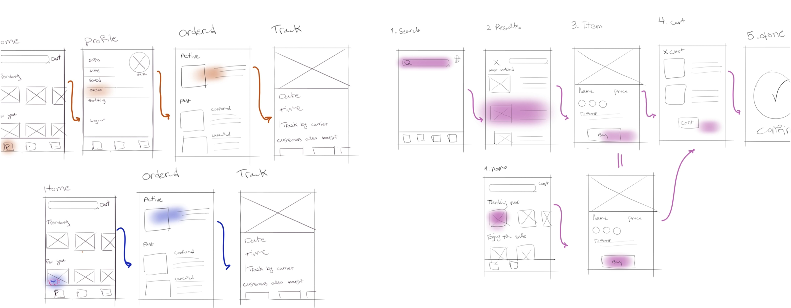
Home, Profile, Settings and Basket, then a six-screen search flow
The sketches were rebuilt as clickable low-fidelity wireframes, so the navigation and search flow could be tested before any visual design work began.
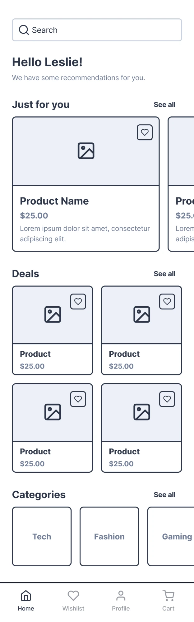
Home wireframe
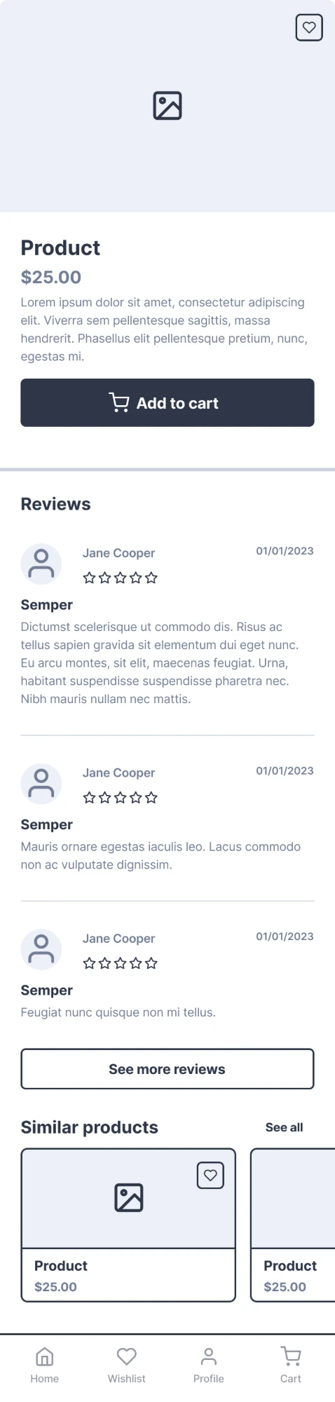
Product wireframe
Mapping every screen before designing any of them
A full site map — from onboarding through search, categories, deals, cart, profile, orders and wishlist — kept every screen's navigation consistent once high-fidelity design started. Click a screen, or a linked row inside it, to trace where it leads.
Drag to pan · click a highlighted row to trace its link · use +/− to zoom
Profile, orders, checkout and product detail — built out in full
The finished UI: account and interests, live order tracking, search, filtering, and the DualSense product page — with the cart sheet surfacing right where "Add to cart" leaves off.
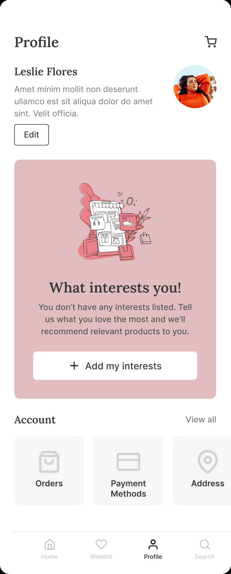
Profile
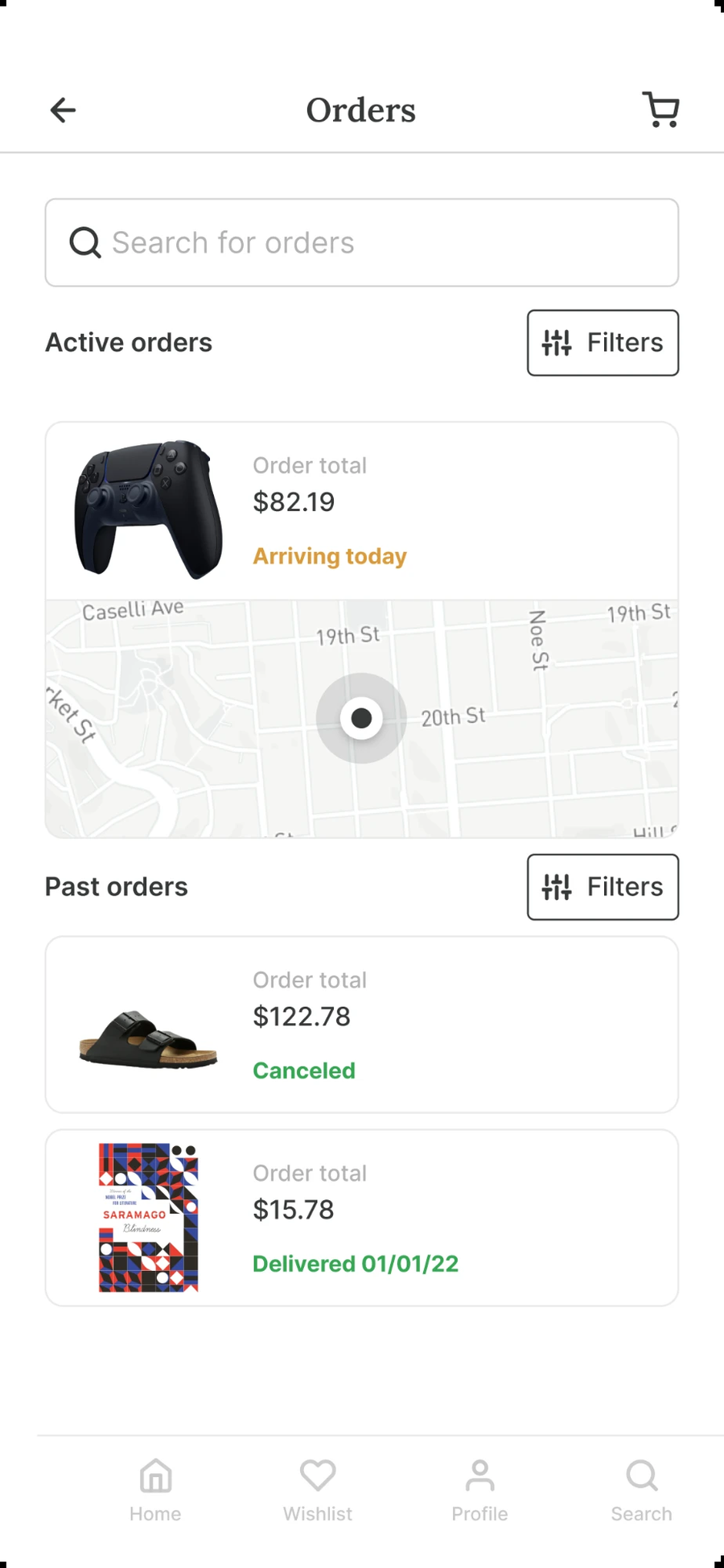
Orders
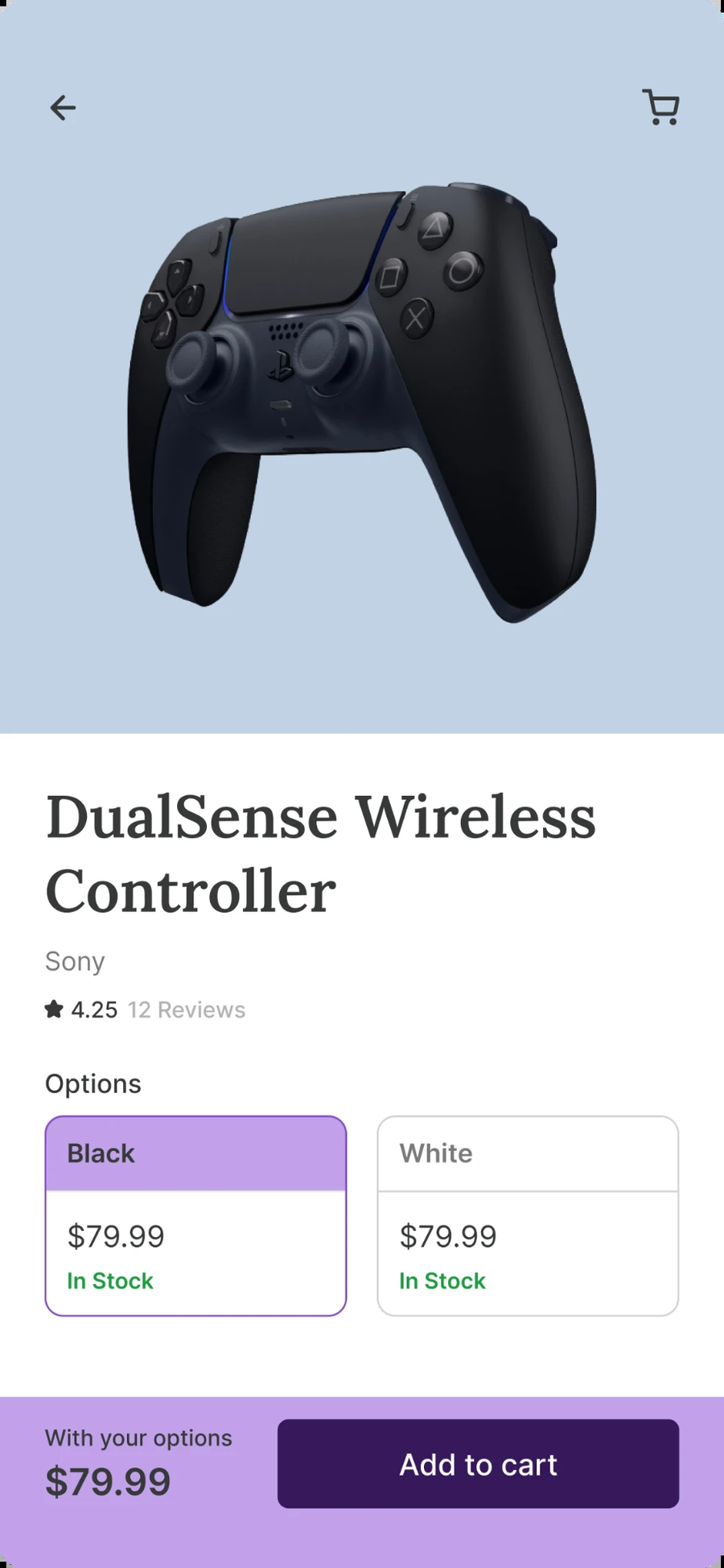
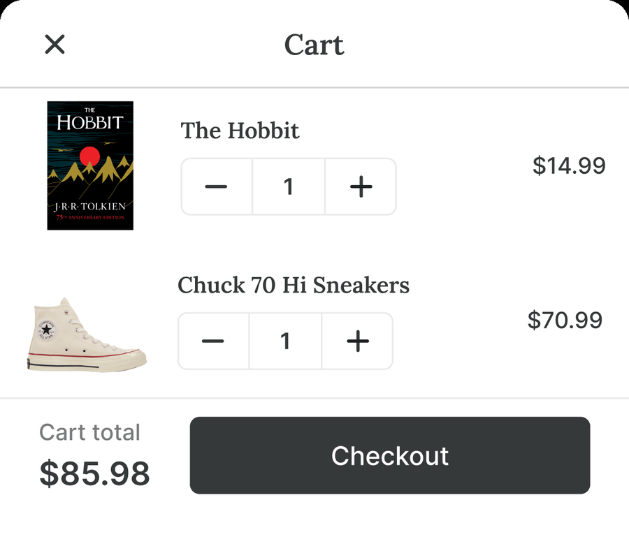
Product detail → Cart
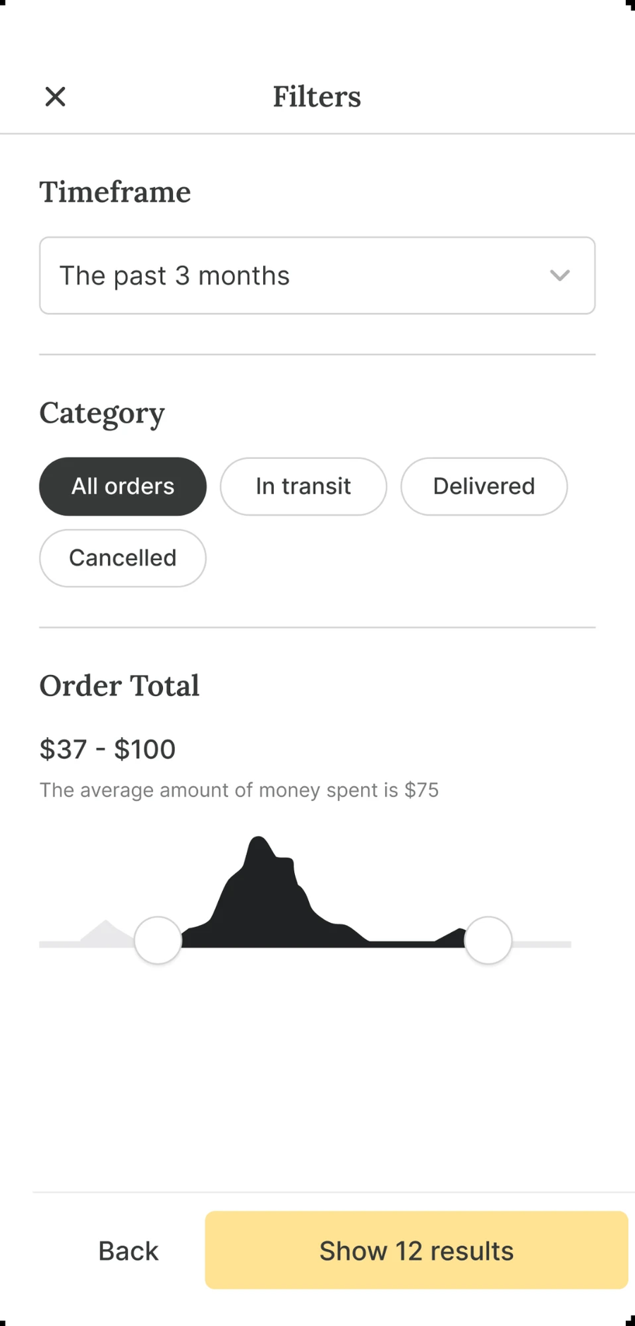
Filters
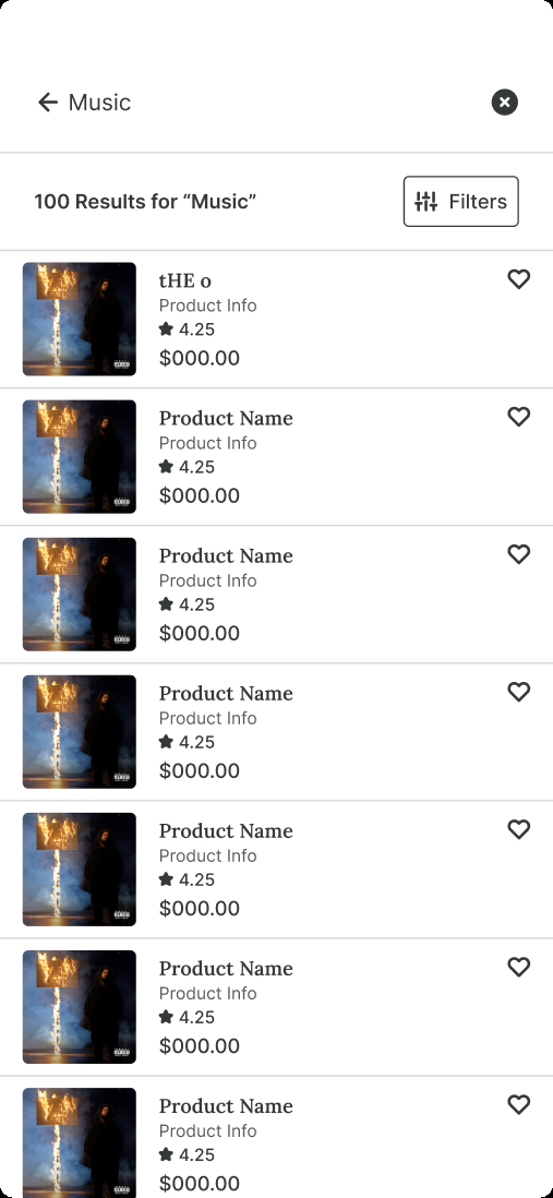
Search results
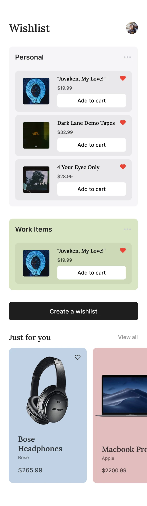
Wishlist
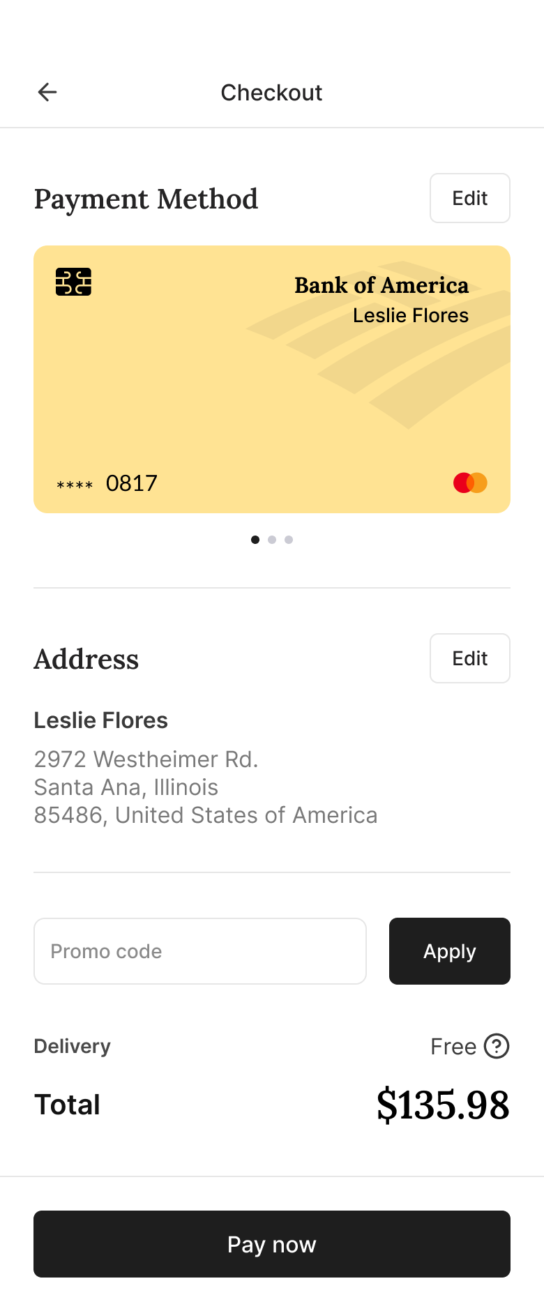
Checkout
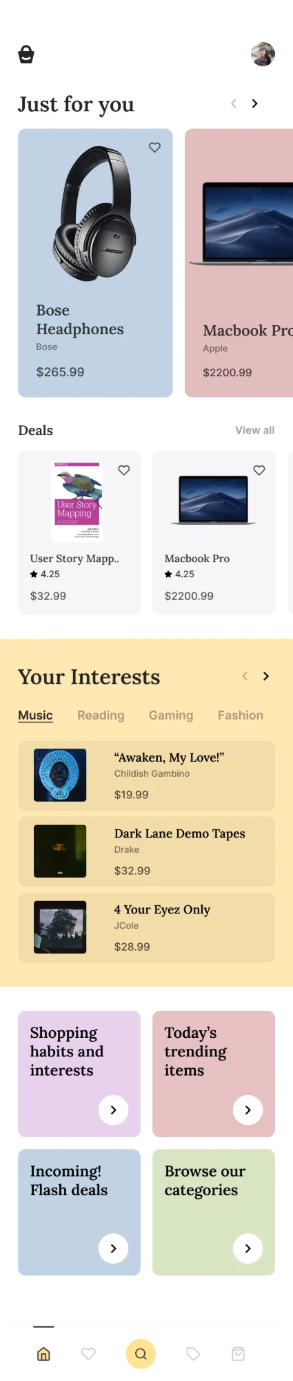
Home & interests
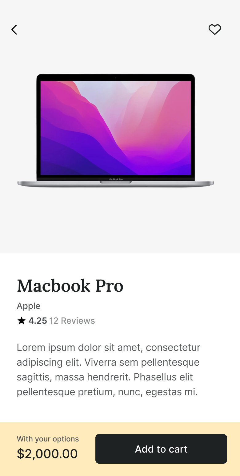
Product detail
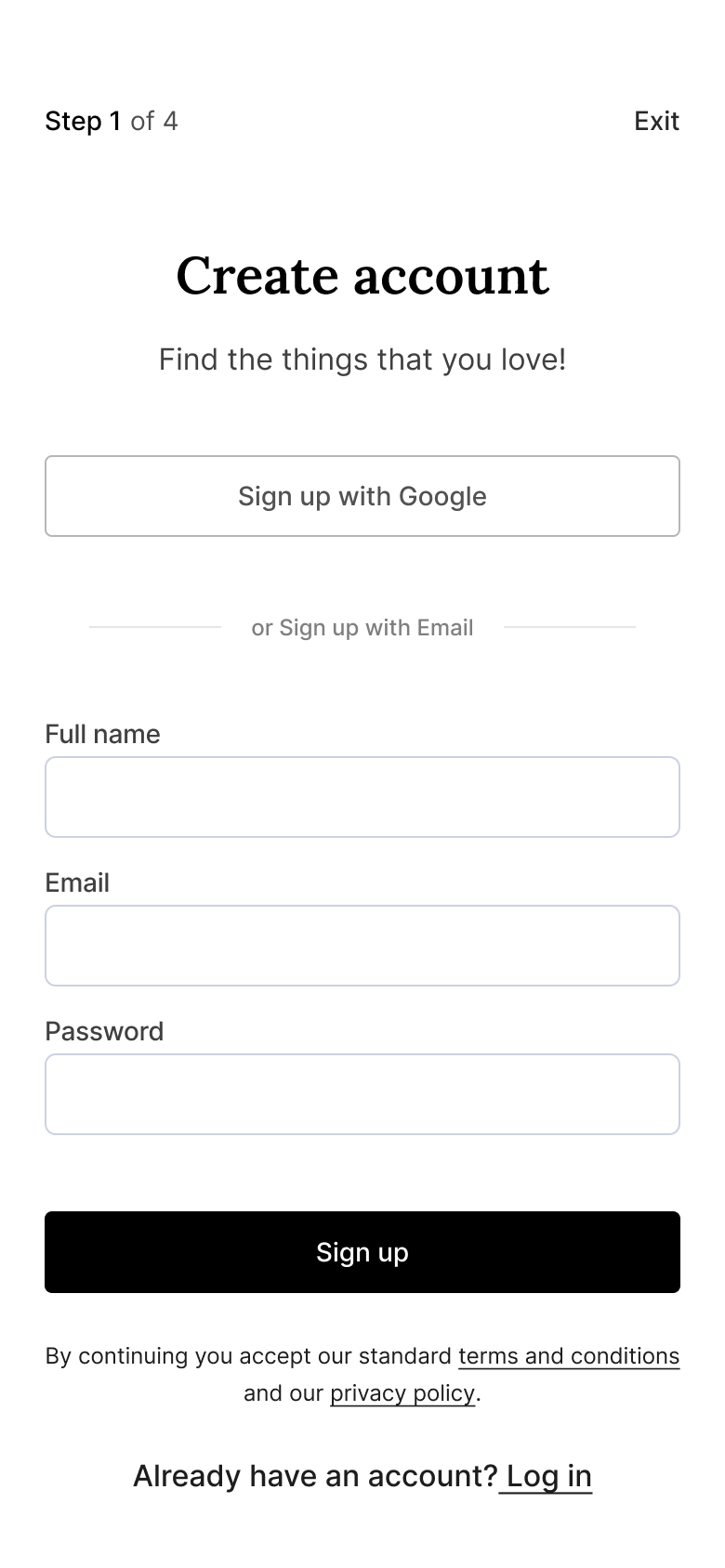
Sign up
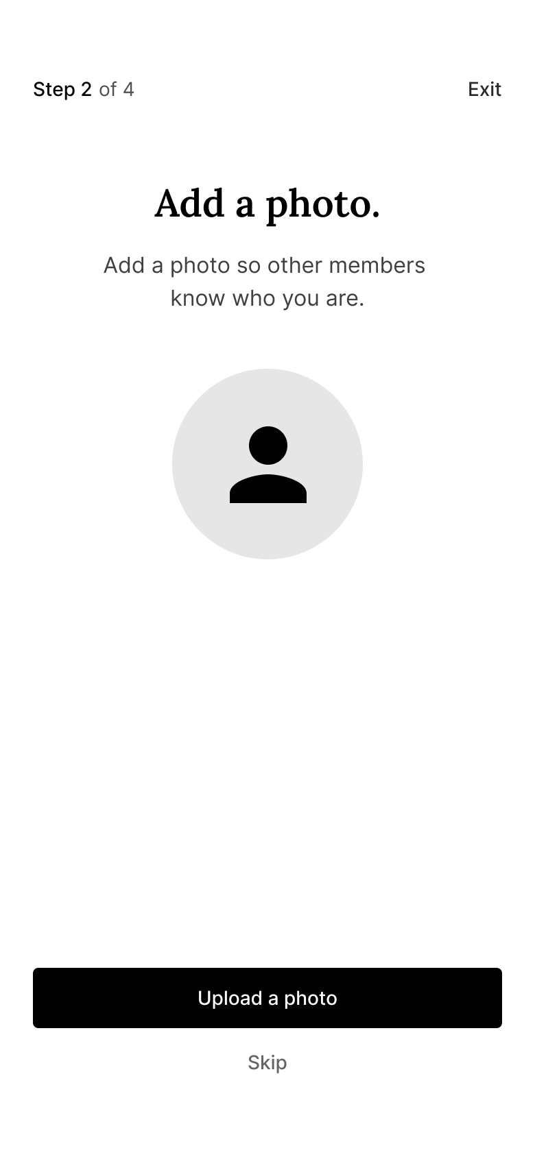
Add a photo
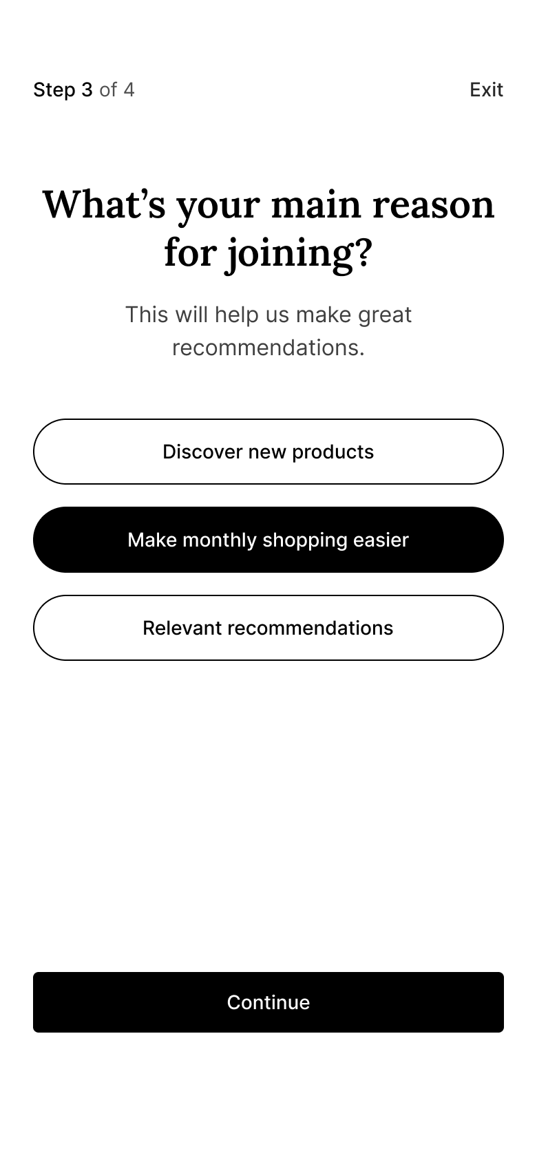
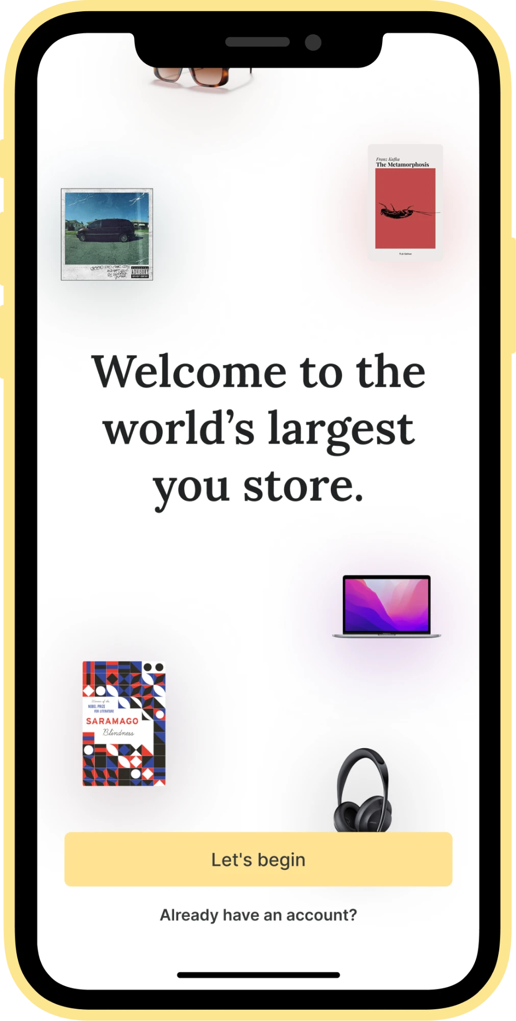
Onboarding
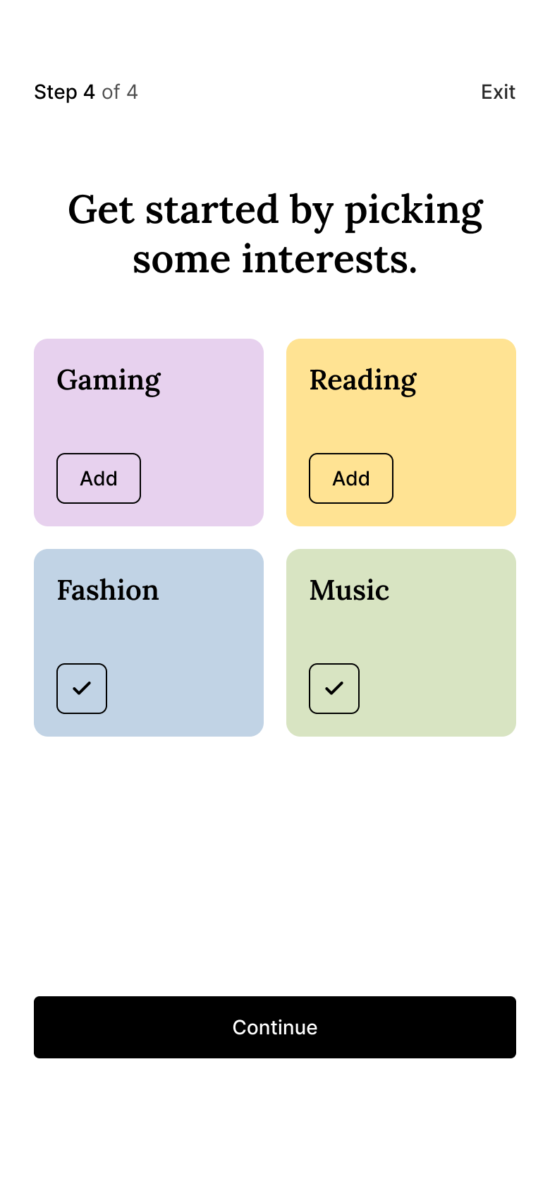
Pick interests
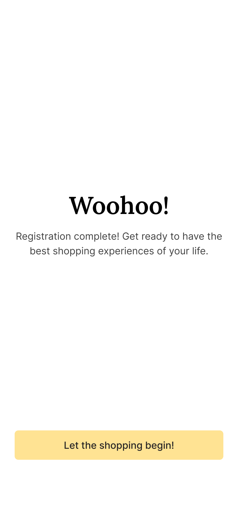
Registration complete